Should you invest in the KLCI or let the EPF manage your savings?
Case Notes 16. This article looks at the performance of the KLCI relative to the financial performance of the component companies. It is one of the inputs in deciding whether you are better off in withdrawing your EPF savings to invest in the KLCI.
Warren Buffett is one of the most iconic and successful investors of our time. But he acknowledged that individual stock picking is not for everybody. In fact, most average, long-term investors would benefit from a much simpler strategy. He had advised in investing in low-cost index funds.
"A low-cost index fund is the most sensible equity investment for the great majority of investors…By periodically investing in an index fund, the know-nothing investor can actually out-perform most investment professionals."
You should not be surprised then that when I retired about 15 years ago, there was the question of whether I should withdraw my savings with the Employers Provident Fund (EPF) and invest them in the KLCI.
But as I would illustrate in this article, if I was a layman without any value investing knowledge, it would have been better to keep my savings with the EPF rather than withdraw it to invest in the KLCI.
However, in my case, I did not invest in the KLCI as I am a value investor with better performance than the KLCI or the EPF.
Secondly, while most of my investments were in small and mid-cap companies, there were occasions when I invested in large cap ones. As such my interest is not only in the performance of the KLCI but also in those of its component companies.
Should you then avoid index funds? Read my Disclaimer!
Contents
- Summary
- KLCI Background
- KLCI vs EPF
- Base rates
- KLCI vs Component companies’ financial performance
- Methodology
- Appendix 1
This blog is reader-supported. When you buy through links in the post, the blog will earn a small commission. The payment comes from the retailer and not from you. Learn more. |
Summary
- The KLCI had grown at 6.8 % CAGR from 1976 to 2020. During the same period the Malaysian GDP had grown at 5.6 % CAGR.
- Over the same period, a "know-nothing" investor would have about the same return but without the drawdown if he had kept his money with the EPF rather than withdrew it to invest in the KLCI.
 |
| Chart 1: Index Performance |
- From 2010 to 2020, the KLCI had a CAGR of 0.2%. This was much better than the median ROE of the component companies which had a compounded decline of 7%. There was no significant correlation between the KLCI and the financial results of the component companies during this period.
 |
| Chart 2: ROE vs KLCI |
- The main cause for the decline in the median ROE was the decline in the net profit margin. The positive news was that the KLCI component companies had good cash generation track records. The median Cash Flow from Operations grew at a CAGR of 10.6 % from 2010 to 2020.
KLCI Background
According to Investopedia:
“An index is a method to track the performance of a group of assets in a standardized way. Indexes typically measure the performance of a basket of securities intended to replicate a certain area of the market.”
The value of the stock market index is computed using values of the underlying stocks. Any change taking place in the underlying stock prices impact the overall value of the index. If the prices of most of the underlying securities rise, then the index will rise and vice-versa.
The stock market index acts like a barometer which shows the overall conditions of the market. They facilitate the investors in identifying the general pattern of the market. Investors take the stock market as a reference to decide on which stocks to invest in.
The KLCI was first introduced on 4 April 1986 as the Kuala Lumpur Composite Index (KLCI), with a base value of 100, dated on 1 January 1977.
In 2006, Bursa Malaysia partnered with FTSE to provide a suite of indices for the Malaysian market.
- FTSE Bursa Malaysia KLCI was one of the indices created to replace the KLCI.
- The new index was adopted on 6 July 2009, with the opening value taken from the closing value of the old KLCI on 3 July 2009.
The FTSE Bursa Malaysia KLCI comprises the largest 30 companies listed on the Main Board by full market capitalization that meet the eligibility requirements. According to Bursa Malaysia, the two main eligibility requirements are the free float and liquidity:
- Each company is required to have a minimum free float of 15%.
- A liquidity screen is applied to ensure the company's stocks are liquid enough to be traded.
FTSE uses the real time and closing prices sourced from Bursa Malaysia to calculate the FTSE Bursa Malaysia KLCI. Calculation is based on a value weighted formula and adjusted by a free float factor. The FTSE Bursa Malaysia KLCI values are calculated and disseminated on a real time basis every 15 seconds.
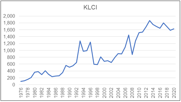
How had the KLCI performed from 1977 to 2020?
- The KLCI had grown at 6.4 % CAGR during this period.
- Its largest drawdown was during the Asian Financial Crisis when it dropped by almost half from 1996 to 1998. It took almost 13 years for the index to recover to the level before the drop.
- The next largest drawdown was during the US sub-prime crisis in 2007 when it dropped by about 40%. This time it took less than 3 years to recover to the level before the drop.
KLCI vs EPF
The chart below shows the KLCI compared to the EPF index and the Malaysian GDP index.
- The KLCI was assumed to start with 100 in 1976.
- The EPF Index was constructed with 100 as the base in 1976. The index for the following year incorporated the dividend declared for the year.
- The GDP Index was constructed with 100 as the base in 1976. The index for the following year incorporated the GDP growth rate for the year.
You can see that all 3 indices had grown at different rates from 1976 to 2020.
- The KLCI had grown at a 6.8 % CAGR.
- The Malaysian GDP had grown at 5.6 % CAGR. The correlation between the KLCI and the Malaysian GDP was 0.92
- The savings in the EPF had grown at 6.7 % CAGR. The correlation between the KLCI and the EPF was 0.90.
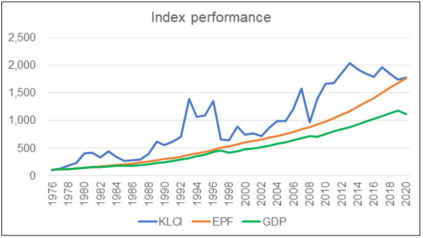 |
| Chart 1 (Reproduced): Performance Index |
You can see that in 2020, the EPF index and the KLCI had about the same index readings.
The result for the EPF was interesting as it meant that a "know-nothing" investor could achieve the same return as the KLCI but without the drawdown. If you had invested in the KLCI, you needed nerves of steel to withstand the 1996/98 and 2007/08 drawdowns. I suspect not many investors would be able to just let their investments ride the drawdown. As such it makes more sense for the "know-nothing" investor to stick with the EPF.
The other interesting result was that the KLCI performed better than the Malaysian GDP. One possible reason for this is that the KLCI component companies represented the best companies in the country. Since the GDP is based on the economy as a whole, it comprises the best companies as well as the poor performing ones.
But for this rationale to be valid, the KLCI should reflect the financial performance of the component companies. I do not have data for the financial performance of the component companies from 1976. However, the past 11 years data were available. I thus tried to answer this question based on the data from 2010 to 2020.
The first step then was to compile the data on the financial performance of the component companies which also serve as base rates.
Base rates
While most of my investments were in small and mid-cap companies, there were occasions when I invested in large cap ones. In such situations, for the company analysis, I used the performance of the KLCI components companies as the base rates.
If you want to understand more about base rates refer to the following articles:
In this post, base rates here refer to the performance of the 29 component companies of the KLCI. While there are 30 components companies, Sime Plantations Bhd did not have publicly available financials from 2010 to 2020. As such the base rates covered only 29 companies. Refer to Appendix 1 for the list of companies.
The profile of the 29 companies in terms of Total Equity and Total Assets in 2020 are shown in the following 2 histograms. As you can see, the distributions are skewed:
- About half of the panel is either relatively very large or very small in terms of Total Assets.
- In terms of Total Equity ie (SHF + MI), the panel was skewed towards the relatively small end.
- Note that big or small in this context is with regards to RM 70 billion or RM 10 billion respectively.
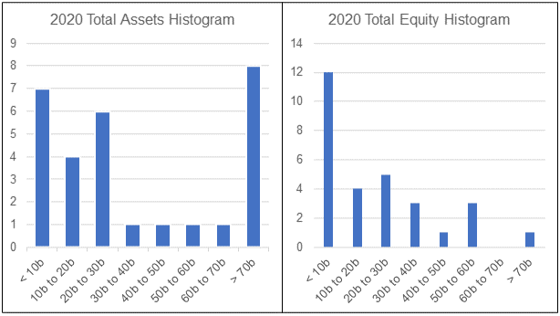 |
| Chart 4: Total Assets and Total Equity Histogram |
The growth of the Total Assets and Total Equity for the panel can be seen from the charts below where I have plotted the average and quartile values.
There are 2 measures of average or central tendency:
- The mean which is the simple average of the values within the range.
- The median which is the middle number in a sorted list of ascending values.
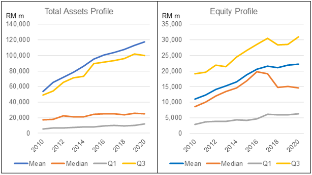 |
| Chart 5: Total Assets and Equity Profile |
You can see that the mean and median are not the same especially for Total Assets whose distribution is skewed to both sides. Because of the skewed distribution, the median is a better representation of the average.
- The median Total Assets grew at 3.7 % CAGR from 2010 to 2020.
- The median Total Equity grew at 5.5 % CAGR from 2010 to 2020.
From an investment perspective, the component companies did not perform well as it had a declining median ROE of 7 % per annum on a compounded basis. The main cause for the decline was the decline in the net profit margin. The positive news was that the panel had a good cash generation track record.
- The median Cash Flow from Operations grew at a CAGR of 10.6 % from 2010 to 2020.
- When measured as Cash flow from Ops/Revenue, this metric grew at a CAGR of 5.2 %
Details of the panel performance are presented in the following sections.
Revenue and PAT
The median annual revenue for the panel was RM 7.8 billion. From 2010 to 2020, the median revenue grew at 3.7 % CAGR.
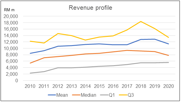 |
| Chart 6: Revenue Profile |
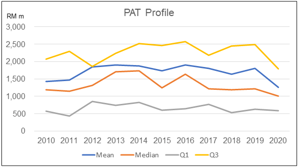
While there was revenue growth, the median PAT for the panel contracted at a compounded rate of 1.7 % per annum from 2010 to 2020. Part of this contraction can be attributed to the 2020 Covid-19 measures.
 |
| Chart 7: PAT Profile |
But as can be seen, the median PAT grew from 2010 to peak in 2013/14 and had not been able to match the peak values since then.
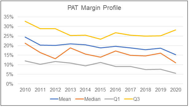
However, when you look at the median PAT margin, the 2020 median margin of 11 % is almost half of the 2010 median PAT margin of 21 %. Over the past 10 years, the median PAT margin had experienced a contraction.
 |
| Chart 8: PAT Margin Profile |
Returns
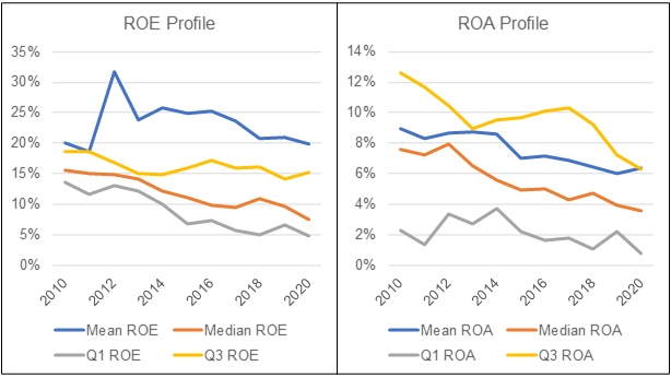
I looked at returns from both the ROE and ROA perspectives. Given the declining PAT, you should not be surprised to see a long-term decline in both these metrics. From 2010 to 2020,
- The median ROE declined at a compounded 7 % per annum.
- The median ROA declined at a compounded 7.2 % per annum.
 |
| Chart 9: ROE and ROA Profiles |
I also carried out a DuPont analysis of the ROE to get an understanding of what drove the decline in ROE. As can be seen from the table, the biggest driver was the decline in the Net Profit Margin.
 |
| Table 1: Change in the DuPont Components |
 |
| Chart 10: DuPont Components Profile |
Debt
I looked at the following metrics to gauge the Debt position of the panel:
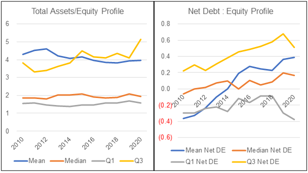
- Leverage or Total Assets/Equity. The panel had an average median Leverage of 1.94 during the period from 2010 to 2020. The median Leverage did not show much variation during the period.
- Net Debt to Equity where Net Debt = Loan - Cash. The median Net Debt grew from - 0.06 in 2010 to 0.17 in 2020.
 |
| Chart 11: Debt Profile |
Cash from Ops
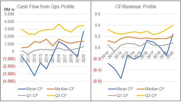
The panel had a good Cash Flow from Operations track record.
- The median Cash Flow from Operations grew at a CAGR of 10.6 % from 2010 to 2020.
- When measured as Cash flow from Ops/Revenue, this metric grew at a CAGR of 5.2 %
 |
| Chart 12: Cash Flow Profile |
KLCI vs Component companies' financial performance
A company’s stock price is the clearest measure of market expectations about its performance. As such you would expect some link between the KLCI and the financial performance of the component companies.
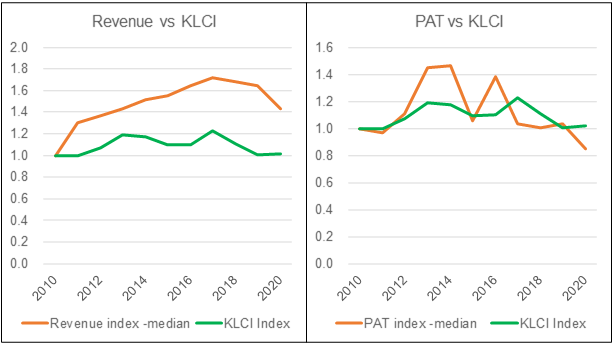
To see whether there was such a link over the past 11 years, I compared the KLCI with the following metrics of the component companies:
- Median Revenue.
- Median PAT and median Net Profit Margin.
- Median Net Debt
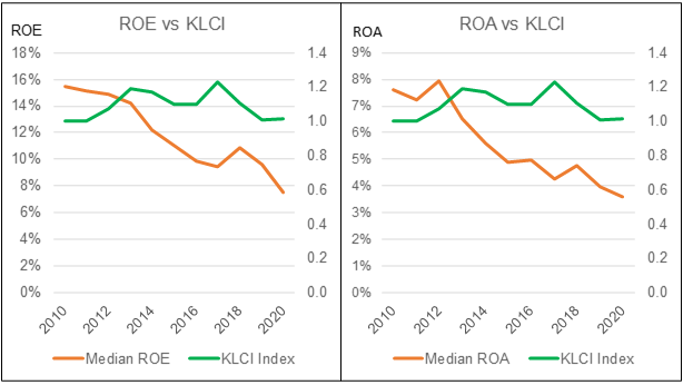
- Median ROE and median ROA.
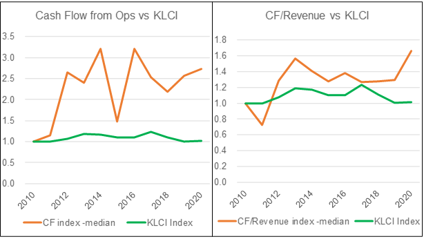
- Median Cash Flow from Operations.
The goal was to see whether there could be some predictive measure that could be used for investing in the index.
The conclusion is that over the past 11 years, the performance of the KLCI did not reflect the business performance of the component companies. This was a surprising result. Details are presented in the following charts and sections.
 |
| Chart 13: KLCI vs Component Companies Revenue and PAT |
 |
| Chart 14: KLCI vs Component Co PAT Margin and Net Debt Equity |
 |
| Chart 15: KLCI vs Component Co Returns |
 |
| Chart 16: KLCI vs Component Co Cash Flows |
I also computed the correlation between the KLCI and the various metrics. Since the financial results for the year were only know later compared to the KLCI, I also computed the correlation with the KLCI ahead and behind by a year.
There were then 3 types of comparisons:
- Same year comparison. Thus the 2010 to 2020 KLCI values were compared with the 2010 to 2020 values of the respective metrics.
- KLCI ahead by one year. Thus the 2011 to 2020 KLCI values were compared with the 2010 to 2019 values of the respective metrics.
- KLCI behind by one year. Thus the 2010 to 2019 KLCI values were compared with the 2011 to 2020 values of the respective metrics.
The results of the analyses were summarized as follows. You can see both positive and negative correlations.
 |
| Table 2: Summary of Correlation |
Generally, a correlation is only considered significant if the value is > 0.7 or < - 0.7. None of the metrics met this standard although Revenue and PAT came close.
The conclusion is that over the past 11 years, the performance of the KLCI did not reflect the business performance of the component companies. A good picture of this disconnect is the trend of the KLCI and the component companies' ROE. During this period, the KLCI grew at 0.2 % CAGR whereas the median ROE of the component companies contracted at a compounded annual rate of 7 %.
From a value investment perspective this is a strange result. The stock market is supposed to reflect the business performance of the companies in the long run. I can think of the following reasons for this anomaly:
- There were not enough data points with only 11 years of results.
- The profile of the component companies changes from year to year.
- The market was very sentiments driven during this period.
This is indeed food for thought for those investing directly in the KLCI component companies. The message is to ignore the KLCI when stock-picking among the component companies.
Methodology
While there are 30 components companies, Sime Plantations Bhd did not have publicly available financials from 2010 to 2020. As such the base rates covered only the 29 companies. The component companies were based on the list as of 1st Jan 2021 as shown in Appendix 1.
The data for the base rates were extracted from the Financial Statements for each company for the period 2010 to 2020. Note that it comprised of companies with different financial year ends.
The Financial Statements was taken from a platform/app called TIKR. It has been described as “The 1 Stop Platform To Do All Your Stock Market Research On”.
I have 2 types of analyses:
- The mean of the sector. This is actually the average for the 29 companies making up the panel.
- The distribution of individual companies making up the panel. For these, I extracted the quartiles and median for each year based on the ranking of the respective metric for each year.
I have the following example to illustrate the difference between these 2 types of analysis.
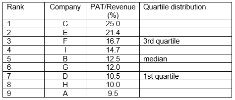
Suppose that there are 9 companies in the panel with the Revenue, PAT, and Profit margin (PAT/Revenue) as shown in the table below.
 |
| Table 3: Profile of sample companies |
To get the distribution of the Profit margin, the companies were ranked (from largest to smallest) based on profit margin with the results below.
This is then used to determine the quartile and median values.
The average profit margin for the sector is derived by dividing the total PAT for the panel by the total revenue for the panel.
Sector average profit margin = 121 / 865 = 14.0 %.
You can also get the average profit margin by adding up individual company profit margin (132.3) and dividing by 9 = 14.7 as shown in the table.
There are then 2 average profit margins for the panel.
- The 14.0 % is looking at the performance of the companies as a whole.
- The 14.7 % is looking at the distribution of individual profit margins.
The values are different because we are looking from different viewpoints. In my analysis I am more interested in the former.
Secondly, while I used the term “average”, there are actually to 2 measures of average or central tendency:
- The mean which is the simple average of the values within the range.
- The median which is the middle number in a sorted list of ascending values.
You can see that the mean and median are not the same. Because of the skewed distribution, the median is a better representation of the average.
Limitations
The analysis covered 29 out of the 30 component companies. However, since I am using the median as the measure of central tendency, the analyses do provide a picture of the financial performance of the panel.
The bigger concern is that the component companies are not the same over the past 10 years. This is because the list is reviewed periodically to identify the top 30 companies by market capitalization.
In practice about one or two companies are replaced each time. The companies that get replaced are those at the bottom of the list in terms of market capitalization. By using the median as the measure of central tendency, changes in the bottom of the list are unlikely to affect the median values.
I would conclude that the median values provided a good picture of the top 30 companies under Bursa Malaysia.
This is despite tracking the results of the same companies over the 11 years period while the KLCI comprised of different companies. I would have the same conclusion for the upper quartile (Q3) results. But I am not too sure about the lower quartile (Q1) values.
Base rates details
The information on the base rates presented in this article is a summary of the various metrics. There is actually a lot of details compiled. Different investors look for different things when analysing companies. As such if you need specific details, do feel free to contact me at i4valueasia@gmail.com.
For a fundamental investor, base rates are important as they help ensure that the assumptions used in the analysis and valuations are realistic. If you do not have such information but still want to invest based on fundamentals, one way is to rely on third-party analysis and valuation.
Appendix 1
List of companies covered in the analysis. Note that I excluded Sime Plantations as there were no publicly available financials from 2010 to 2020.
Axiata
CIMB Group
Dialog
DiGi.Com
Genting
Genting Malaysia
Hap Seng
Hartalega
Hong Leong Bank
H L Financial Group
IHH Healthcare
IOI Corp
KL Kepong
Maybank
Maxis
MISC
Nestlé
Petronas Chemical
Petronas Dagangan
Petronas Gas
PPB Group)
Press Metal
Public Bank
RHB Capital
Sime Darby
Supermax
Tenaga
TM
Top Glove
End
- - - - - - - - - - - - - - - - - - - - - - - - - - - - - - - - -
How to be an Authoritative Source, Share This Post
|
Disclaimer & Disclosure
I am not an investment adviser, security analyst, or stockbroker. The contents are meant for educational purposes and should not be taken as any recommendation to purchase or dispose of shares in the featured companies. Investments or strategies mentioned on this website may not be suitable for you and you should have your own independent decision regarding them.
The opinions expressed here are based on information I consider reliable but I do not warrant its completeness or accuracy and should not be relied on as such.
I may have equity interests in some of the companies featured.
This blog is reader-supported. When you buy through links in the post, the blog will earn a small commission. The payment comes from the retailer and not from you.





Comments
Post a Comment